

89.0 update changed theme
Update 89.0 changed the browser theme to something I don't like, too pale and pastel. Options to change back to what I had aren't available. The options presented are now uglier than this sick looking theme.
How do I undo 89.0 update? Pretty much looks like (from release notes on another post) 89.0 has nothing at all to do with security and it's just someone at Firefox wanting to change things just for the sake of changing things.
I hope Firefox isn't going to start doing silly things like moving the first floor to the second floor and the second floor to the first floor just because some administrator feels like it.
All Replies (20)
Hi lee37, there's an add-on theme that brings back the dark navy background (old Windows 10 "default" style) to the top of the toolbar area:
https://addons.mozilla.org/firefox/addon/photon-colors/
Does that help?
These UI overhauls occur every 4-5 years. The blog post has the story behind today's changes: https://blog.mozilla.org/en/products/firefox/new-firefox-coming-june-1/
Thank you. Never would have found where Firefox hid that.
The blog/link mentions Firefox getting feedback from its customers on how'd they like Firefox to look. I was never asked anything. I was never warned of anything. I was never presented with options. Actually, I don't believe for one second there was any feedback from customers.
I didn't expect this from Firefox.
I'm having this problem myself. Using a Windows 10 theme, or any other theme for that matter, is not a solution. I'm using Windows 7 x64 and Firefox 89.0 x64, and I've chosen the theme "System Theme" and checked the "Use System Colors" box in Settings->General->Language and Appearance->Fonts and Colors->Colors dialog. Yet I still have this sickly gray at the top of the Window that reminds me of a Macintosh from 1989! Not acceptable. And the change was unnecessary as stated in the original posting. But I really like FF. Is there any way to change this sickly gray back to the actual system color (should be the default color of a button face in Windows)? I'm OK with editing the about::config settings if needed. The text in this area is difficult for me to see (low contrast AND transparent), and there seems to be no way offered to make it actually match what the system says should be the color there.
Dave said
Is there any way to change this sickly gray back to the actual system color (should be the default color of a button face in Windows)? I'm OK with editing the about::config settings if needed.
It wouldn't be in about:config... you could take a look at the Firefox Color extension which lets you specify the actual colors of various bits and pieces of the toolbar area. That's probably faster than sifting through a bunch of themes.
A terrible change. The little "folder" icons on the bookmark bar are absolutely useless, literally a waste of space. (Yes I am grumpy! I am away from home, getting connected is a bit of a hassle, so the last thing I need is FF changing its appearance on me without a warning.)
gidiav said
A terrible change. The little "folder" icons on the bookmark bar are absolutely useless, literally a waste of space.
The wireframe aesthetic is not my preferred style. But are you saying you liked the previous folders better, or you don't see the point of having folder icons at all? I'm not quite sure what you're looking to get to.
I don't even remember that there were folder icons before... They must have been less obtrusive.
Firefox would be better off concerning itself with security and speed. It should hire technicians and fire the graphic designers. None of us have the time or desire to have to relearn where everything is and how to operate a system because some useless design team is trying to justify their jobs to Firefox. Example - once a person gets on the mozilla website you have to go through four pages to get to the page to sign-in to get to this forum. What's up with that? It's no wonder why Chrome has shot to number one. Even if Firefox may be safer, if it shoots itself in the foot because it employs designers instead of technicians in order to surprise customers with hassles - guess what's going to happen. Give a customer a hassle - loose a customer.
I tried this link https://addons.mozilla.org/firefox/addon/photon-colors/ , and it's better, but it's still not like it was. Also, my Bookmarks menu is changed with the bookmarks spaced farther apart, so I have to scroll down to get to bookmarks that used to be readily available. I have a lot of bookmarks that I use regularly, and now half of them can't be seen immediately when I go to my Bookmarks. I want to be able to see all of them again and not have to scroll down for them. How do I change my bookmarks menu back to the way it was? I thought maybe the link provided would fix that problem, too, but it didn't.
To lee37, agreed. Why mess with the aesthetics that people are used to? It doesn't enhance anything or make anything better, only worse. It was perfect the way it was. Firefox screwed up the homepage and the Bookmarks. The change to the Bookmarks actually makes Firefox LESS user friendly because people have to go through an extra step to get to some bookmarks that were previously readily available. I'm wondering what other things they screwed up. Firefox, don't fix what isn't broken.
ravenmadigan said
Also, my Bookmarks menu is changed with the bookmarks spaced farther apart, so I have to scroll down to get to bookmarks that used to be readily available. I have a lot of bookmarks that I use regularly, and now half of them can't be seen immediately when I go to my Bookmarks. I want to be able to see all of them again and not have to scroll down for them. How do I change my bookmarks menu back to the way it was?
I'm only aware of one way to do that, which is to apply custom style rules in a userChrome.css file. If you don't find another method, I have the instructions in the following thread:
"Update 89.0 changed the browser theme to something I don't like, too pale and pastel." That's a pretty good description of what happened to me.
I accepted the latest update to 89.0 and now my tabs have white text on a light blue background. That is not readable. The Firefox settings page has something about changing some colors but not those.
What is a theme? I never selected a theme. I go looking for themes and I find a list saying which theme I have and not giving me any options for making changes to it.
In the past, Firefox has been the exception to the rule "Whenever you update, you lose something."

klovingood said
What is a theme? I never selected a theme. I go looking for themes and I find a list saying which theme I have and not giving me any options for making changes to it.
Themes are color schemes. On the page in your screenshot (built-in Add-ons page, Themes panel, you can change among the installed themes by clicking their enable button. But there probably isn't one there that is similar to the previous Windows 7 theme. You can use the search box on the page to search for other themes.
Alternately, you can take control and mix your own color scheme using the Firefox Color extension:
I logged into my Firefox account 3 minutes ago, scrolled down this list of justifiable complaints, then had to login again to make this comment. Why twice, why not 4 times? I cannot remember the <version 89 (win10) display of the tabs, probably because it was too natural and ergonomic to notice - just what one needs in a tool. The suggested fix makes some of the icons of the tabs disappear into the background, so one is left only with its fading text. Now, there are no dividing lines between the tabs, so the demarcation is made by a slimey disappearance of the decaying tab name. A waste of space and need for extra concentration to translate a blurred name into a meaningful one. The space on a small laptop screen is precious, each pixel needs to be made to work for its existence. I want a sharp tool. I go to an art gallery for impressionist art. </p>
Improvements I can live with. Dealing with the initial inconvenience is worth the effort. But this change has added nothing and removed some ease of use. And for many people, an ergonomic change can become an unjumpable hurdle, after months of mastering a sequence of look, understand, mouse and click actions, no matter what the technical improvement might be. There are lots of guides on how to improve visual communication - and one recommendation is to be consistent.
I've been following this thread and have not seen my particular beef.
  What's with the white text on black background on the "settings" menu?  IMHO this is worse than terrible. As others have opined,  "change for changes sake" is unacceptable.
  I see on the General tab under fonts and colors there is an option to "override the colors specified by the page with your selections above". If this is set to "always", the SETTINGS page reverts to black on white. I am reluctant to keep this setting because I don't know how it will affect other sites.
For those who are having problems with THEMES, may I suggest under "Tools / Add-ons and Themes", try a search for "themes". I'll bet with almost 36 thousand possibilities you will find something that works for you. Personally, I like "Running Foxes by MaDonna".
I've been following this thread and have not seen my particular beef. What's with the white text on black background on the "settings" menu? IMHO this is worse than terrible. As others have opined, "change for changes sake" is unacceptable. I see on the General tab under fonts and colors there is an option to "override the colors specified by the page with your selections above". If this is set to "always", the SETTINGS page reverts to black on white. I am reluctant to keep this setting because I don't know how it will affect other sites. For those who are having problems with THEMES, may I suggest under "Tools / Add-ons and Themes", try a search for "themes". I'll bet with almost 36 thousand possibilities you will find something that works for you. Personally, I like "Running Foxes by MaDonna".
jal64 said
I've been following this thread and have not seen my particular beef. What's with the white text on black background on the "settings" menu? IMHO this is worse than terrible. As others have opined, "change for changes sake" is unacceptable.
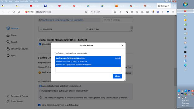
Do you mean the page formerly known as Options that has the General, Search, Privacy & Security, etc. in the left column?
When you use the dark theme, it is normal for built-in pages to follow that theme. Otherwise, hmm, does your system use a dark theme?
I see on the General tab under fonts and colors there is an option to "override the colors specified by the page with your selections above". If this is set to "always", the SETTINGS page reverts to black on white. I am reluctant to keep this setting because I don't know how it will affect other sites.
That has the potential to mess up a lot of sites. For example, buttons delineated by a background color may become invisible.
For those who are having problems with THEMES, may I suggest under "Tools / Add-ons and Themes", try a search for "themes". I'll bet with almost 36 thousand possibilities you will find something that works for you. Personally, I like "Running Foxes by MaDonna".
Hmm, there seem to be two?
- https://addons.mozilla.org/firefox/addon/running-foxes-by-madonna/ - updated 5/28/2021
- https://addons.mozilla.org/firefox/addon/running-foxes-theme-by-m-donna/ - updated 1/14/2020
The newer one definitely triggers dark mode on built-in pages and Proton-style menus; I didn't try the older one. I think this might be the new normal, but perhaps someone else has an idea. (I mean an easy idea, I only have difficult ideas. ;-)
- Yes, I mean the former OPTIONS page. - I was unaware there are two versions of the Running Foxes theme. I am using V7 of the first one you list dated 1/13/20. Based on your comment I doubt I will upgrade to the newer version or consider the second on your list.4.
jal64 said
- Yes, I mean the former OPTIONS page.
This is triggered by using "bright" text in the background tab titles (white in this case). But theme authors obviously can't use dark gray on black, so this new behavior likely affects all themes with dark toolbars. I don't know whether Mozilla would consider changing that in the future to unlink dark themed toolbars from dark themed built-in pages.
I just glommed to much of this thread relating to tabs and tool bars. This doesn't bother me nearly as much as entire pages now are black with white text. I have always found light background with dark text preferable ... but maybe that's just me. I guess I'll just have to get used to it as I am not about to jump thru hoops to get it changed back.