

New view of JSON in the Resonse Payload is confusing
Hi All,
Not sure when this changed but noticed that a recent update changed how the JSON Response Payload is shown.
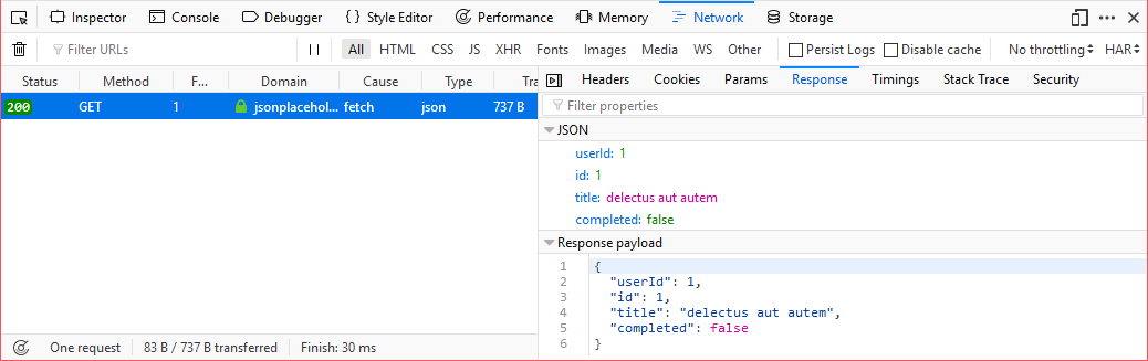
The old way can be seen in this Firefox Documentation https://developer.mozilla.org/en-US/docs/Tools/Network_Monitor/request_details#Response
See attached Image "old.png"
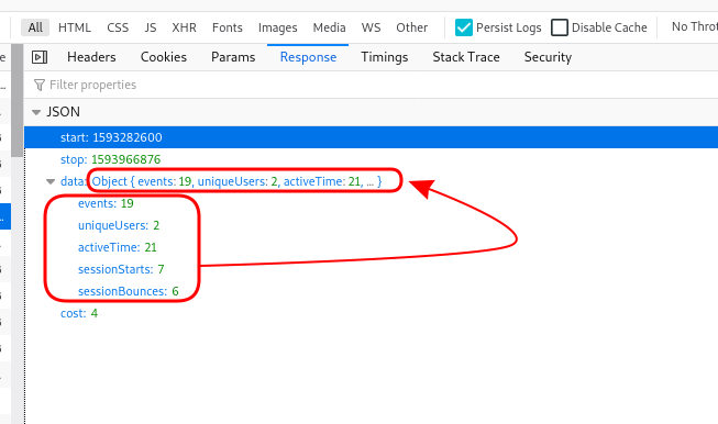
Now see the attached "new.png". As you can see, the Object is summarized and shown on the same line as the Object's parent. This looks very messy when viewing large and/or complicated JSON.
Can someone please help me out to get the old view back?
Sorry if this is already answered. I already did try searching the Net and Firefox forums.
Thanks, Dil
Tutte le risposte (4)
Hi Dil, it is a little cluttered. I'm not aware of a preference for that. You might try the Dev Tools team's forum:
Your second screenshot doesn't show the expanded Response Payload content, but that viewing format could use a "Pretty Print" choice like the JSON viewer offers as it is currently one long line.
jscher2000 said
Hi Dil, it is a little cluttered. I'm not aware of a preference for that. You might try the Dev Tools team's forum: https://discourse.mozilla.org/c/devtools
Thank you. I will check there.
Regards, DIl
cor-el said
Your second screenshot doesn't show the expanded Response Payload content, but that viewing format could use a "Pretty Print" choice like the JSON viewer offers as it is currently one long line.
Say what? I think you are confused with my question.
Please look at the Image that has the red squares and the red arrow. I'm talking about the long summarized JSON object.
Regard, Dil