FF 70 breaks underlining
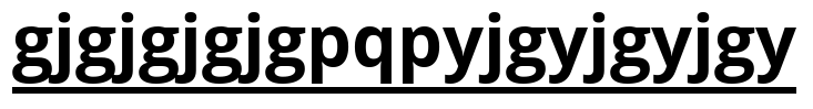
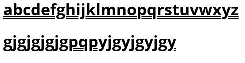
Since updating to FF70, I've noticed that underlined text on websites is broken by punctuation marks or lower case letters with tails, e.g., p, g, y, etc. It didn't do this before. Hope this will be fixed soon!
Soluzione scelta
OK, you can revert this by flipping a pref on the about:config page.
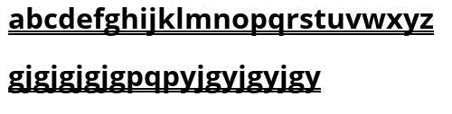
- layout.css.text-decoration-skip-ink.enabled = false
You can open the about:config page via the location/address bar. You can accept the warning and click "I accept the risk!" to continue.
Leggere questa risposta nel contesto 👍 1
Tutte le risposte (8)
No, this is a permanent change to give better visibility and readability to underlined text.
See the Release Notes under changed.
Readability is now greatly improved on under- or overlined texts, including links. The lines will now be interrupted instead of crossing over a glyph.
It looks rather weird if I deliberately try to break it :oops:
Soluzione scelta
OK, you can revert this by flipping a pref on the about:config page.
- layout.css.text-decoration-skip-ink.enabled = false
You can open the about:config page via the location/address bar. You can accept the warning and click "I accept the risk!" to continue.
Modificato da cor-el il
There is support to modify the offset and thickness of the underline, so websites can affect how it looks.
Modificato da cor-el il
Thanks as always cor-el, the config worked!
My eyesight's not great and I never had any problem reading uninterrupted underlined text, only small or irregular fonts or insufficient contrast (e.g., light text on a light background). But as soon as this change was implemented I noticed how weird/ugly it looked - weirder & uglier on text with more punctuation/glyphs and thicker underlining. This appears to me to be a bad 'fix' for a non-existent problem. I certainly think it would make more sense to make the default config setting false.
Then again, maybe it was more of an issue in some languages with a different alphabet...
Anyway, I'm glad I could at least change it back. The ugliness was almost enough to make me try another browser, and I've been a loyal FF user for pretty much as long as there's been a FF!
Modificato da cfcentaurea il
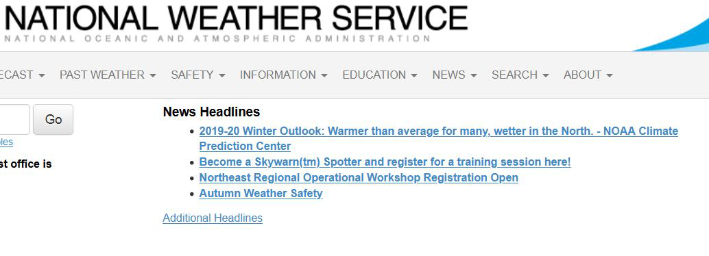
I'm glad I've found this thread, because nobody seems to be talking about it. The underlining break is confusing as heck to me when a single URL is underlined, and the breaks make it seem like there are several URLs.
Navigating to about:config?filter=layout.css.text-decoration-skip-ink.enabled and double clicking the option to set it to [false] fixed the problem for me.
It might seem like a catchy aesthetic to the developers, and maybe a large number of Firefox users, but it's confusing as heck to people with poor vision I think. It looks nice with my glasses, but without the glasses, I'm forced to squint at the text to see if there really is just one URL, or several (thanks to text that drills through the line).
Thanks for the solution, sorry for rambling. I love Firefox, keep up the awesome work everyone.
Hi Larry I'm glad I'm not the only one! If you want to let FF know you don't like it, you can give feedback at https://qsurvey.mozilla.com/s3/FirefoxInput/
It is possible via the offset pref to move the underline a few pixels downwards to avoid issues.
This might be sufficient to see the underline. text-underline-offset: .3em;