

Firefox Home page won't resize content to fit the shape of the window.
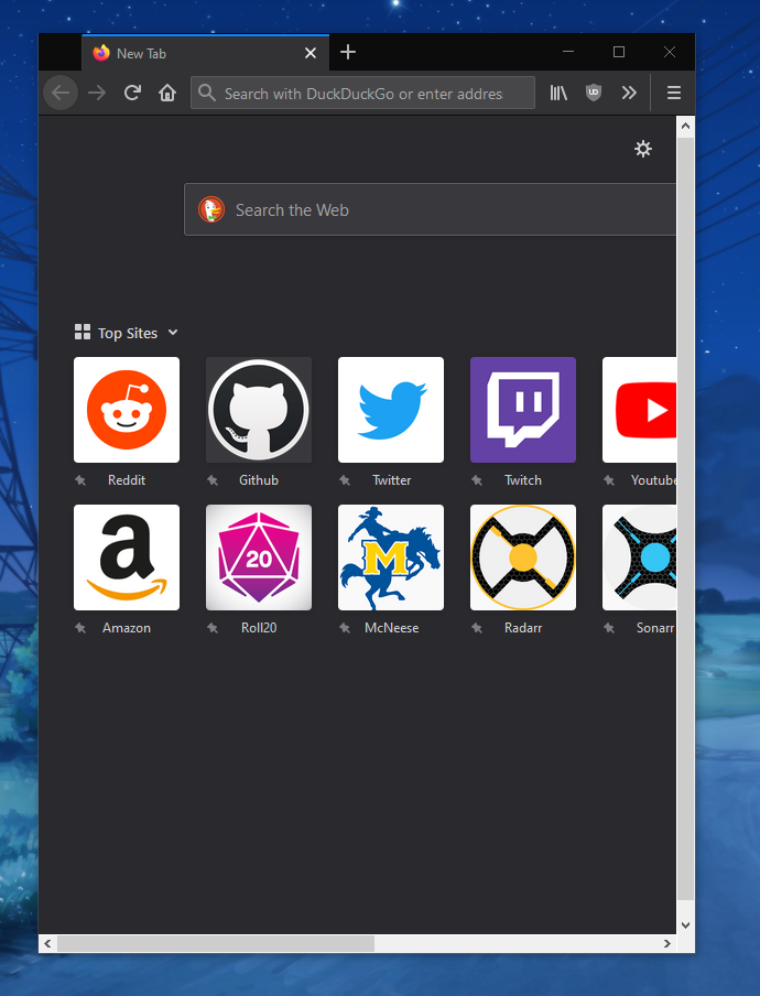
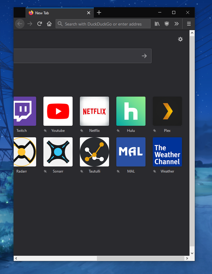
The Firefox Home page does not properly resize content to fit the window size. I have had this issue for a while on my laptop, but it just started to happen on my desktop also with the 70.0 update. I posted about it on reddit a while back to try and find help, but no one was able to give me any. Here are some screenshots of the issue on mac from that original post https://imgur.com/a/vTlXfmJ I just want to know if there is any solution to this issue or if anyone else is reporting it. I haven't been able to find any other posts about it and got basically no response from the reddit.
Soluzione scelta
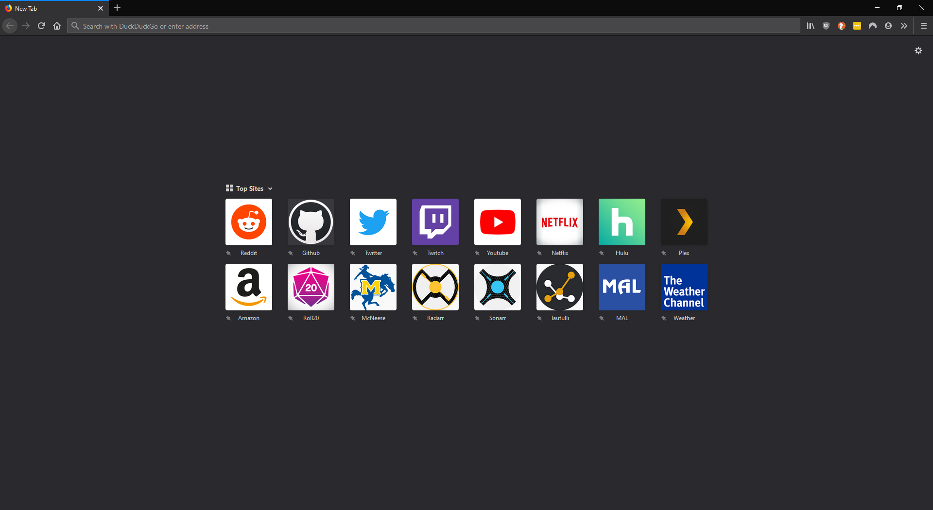
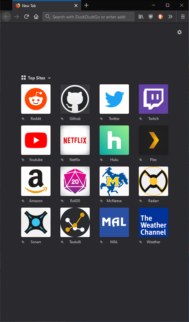
Hi Austin, the layout of the page changed. It previously had a design that could wrap Top Sites tiles to a new row based on the page width, and it now has a fixed width layout.
You could override this using custom style rules in a userContent.css file, but I haven't developed a complete recipe. To get the general idea, here are the variable width rules for the "main" tag adapted to the Top Sites section:
@media (min-width: 610px) {
	.discovery-stream.ds-layout {
		width: 530px !important;
	}
}
@media (min-width: 866px) {
	.discovery-stream.ds-layout {
		width: 786px !important;
	}
}
@media (min-width: 1122px) {
	.discovery-stream.ds-layout {
		width: 1042px !important;
	}
}
To see the effect, while on the new tab page, press Shift+F7 to open the Style Editor tool. Click the + button to add a new style sheet, then paste in those rules. As you reduce the width of the window, the number of tiles in each row of the Top Sites grid should be reduced to fit.
It's not pretty. Someone will need to work on finding the right widths to break at, and also how to deal with the search box.
Leggere questa risposta nel contesto 👍 1Tutte le risposte (7)
Also here are some additional screenshots of how it used to work before the update.
I don't really know what the issue is here, but It may be related to the new rendering system on macOS. That is has been this way on your laptop is weird though. Did you try to reinstall Firefox on one of your devices?
This issue occurs for me on both on Mac and Windows. Also if you look at the image in my second comment you can see how it should look (and used to). I have already reinstalled firefox.
Add-on to change the default zoom level for all websites at once. ... This will help increase the size of web pages.
   1. To make things bigger, press Ctrl and + at the same time.
   2. To make things smaller, press Ctrl and - at the same time.
   3. To reset the size back to normal, press Ctrl and 0 at the same time.
What? This has nothing to do with zooming the web page... The CSS on the Firefox homepage is broken. I am asking how I can fix it so elements properly rearrange when I change the size of my browser window. I have tried a clean install of firefox (deleted user profile and uninstalled) and the problem still persists. Maybe I am not using the right language to describe the issue.
Soluzione scelta
Hi Austin, the layout of the page changed. It previously had a design that could wrap Top Sites tiles to a new row based on the page width, and it now has a fixed width layout.
You could override this using custom style rules in a userContent.css file, but I haven't developed a complete recipe. To get the general idea, here are the variable width rules for the "main" tag adapted to the Top Sites section:
@media (min-width: 610px) {
	.discovery-stream.ds-layout {
		width: 530px !important;
	}
}
@media (min-width: 866px) {
	.discovery-stream.ds-layout {
		width: 786px !important;
	}
}
@media (min-width: 1122px) {
	.discovery-stream.ds-layout {
		width: 1042px !important;
	}
}
To see the effect, while on the new tab page, press Shift+F7 to open the Style Editor tool. Click the + button to add a new style sheet, then paste in those rules. As you reduce the width of the window, the number of tiles in each row of the Top Sites grid should be reduced to fit.
It's not pretty. Someone will need to work on finding the right widths to break at, and also how to deal with the search box.
Oh wow so this was an intentional change? Thanks for the response. I will play around with my userContent.css until I can satisfy my needs.