

How do I get my tabs back below the bookmark toolbar? And why the hell did you change this??? And now white on black? Unreadable.
You really need to employ some graphic artists. This is the worst change I have seen in Firefox. The tabs should be BELOW the bookmark toolbar, right above the pages. That's where your eye most easily rests when you're looking for a tab. I looked at "solutions" but I'm not a freaking software engineer!! I just need to get the tabs back down where they were and can't find a solution. If I can't find one I guess I'll have to go back to Safari, which I don't like as well as I have liked Firefox all these years, but this change is just too much.
Also, it's not bad enough to put the tabs at the top (where your eye does not easily travel to!), but now the tabs are white type on a black background. Perhaps fine for 25-year-old eyes, but not for older eyes or visually challenged people in general. And if you have multiple tabs open, which many multitaskers do, you can only see a few letters. I could go on and on about how horrible this new change is, but please take some advice from a retired graphic designer. Black backgrounds with faint light type are not the way to go.
Soluzione scelta
Lots of issues!
(1) Tab bar position
You can use a custom style rule in a userChrome.css file to rearrange the toolbars.
(A) You need to create a new chrome folder in your profile folder. This article has the steps for that (#1, #2, and optionally #3)
https://www.userchrome.org/how-create-userchrome-css.html
(B) Download the following file and move it into that chrome folder:
https://www.userchrome.org/samples/userChrome-tabs_on_bottom.css
(C) Rename the file to just userChrome.css
The next time you quit Firefox and start it up again, it should discover that file and apply the rules.
Success?
(2) Changing white-on-black text
Firefox 57 has 3 "themes" built in (default, light, and dark) which you can experiment with on the Customize page using the Themes button at the bottom. Could you check whether any of those work for you.
See: Customize Firefox controls, buttons and toolbars
The menu that pops up from the button also has an option to go to the Mozilla Add-ons site to look at additional themes. Many of these are solid colors, while some are quite wild. If you have a preferred shade, I would check there.
If none of that works, a custom style rule could be applied to adjust either a light or dark theme. You'll need to figure out your preferred colors for the active and inactive tabs.
(3) Tab Width Too Narrow
Before Firefox 57, no tab ever was more narrow than 100 pixels. To fit more tabs, that minimum was reduced to 76. You can increase it again using this setting:
(A) In a new tab, type or paste about:config in the address bar and press Enter/Return. Click the button accepting the risk.
(B) In the search box above the list, type or paste tabmin and pause while the list is filtered
(C) Double-click the browser.tabs.tabMinWidth preference and change 76 to your preferred minimum then click OK.
You also can use a custom style rule to make a little more space by hiding the "X" close buttons until you hover your mouse over the tab. This would be something you add to your userChrome.css file. Here's the rule:
/* Hide tab close buttons until hovered */
.tabbrowser-tab:not([pinned="true"]):not(:hover) .tab-close-button {
  display: none !important;
}
Actually, I think below a certain size Firefox will hide them anyway, but maybe that will help in some cases.
Hopefully with these changes Firefox 57 will be more pleasant to look at and more productive to use.
Leggere questa risposta nel contesto 👍 23Tutte le risposte (15)
Anaya said
Do I have to join vimeo ? I can't get the video to play. Is it also - please say yes - on youtube somewhere?
You do not have to join. What is you start playing at the beginning and then click around the 5:30 mark?
'(3) Tab Width Too Narrow
Before Firefox 57, no tab ever was more narrow than 100 pixels. To fit more tabs, that minimum was reduced to 76"
Here is a perfect example of the self-perpetuating nature of software development. Has there been a demand from users of Firefox to be able to have more open tabs showing on the screen? After all, with Firefox you could always group the tabs you needed together and if a tab disappeared off the screen, then you just clicked on the appropriate arrow to bring it back. Much easier to do this than struggle all the time to read the minute tabs with Quantum. It looks very much that showing more tabs was either an "it seemed a good idea at the time" change with no thought given to the consequences on legibility, or was based on the practice of developers to have many more tabs open on their screens than the general everyday user and the idea that if it was useful for developers then it was useful for everyone.
BTW, I tried to put the quote in italics, but the function didn't seem to work.
Modificato da fedup101 il
jscher2000 said
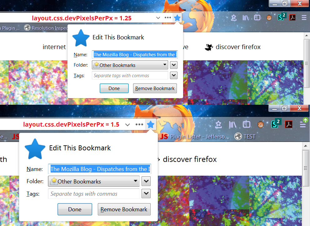
RevertSearch saidSo the zoom is global? How do we apply it to the entire UI and only the UI at once? And how do we restore the boomarks dropdown to its old width?This setting is the global zoom: layout.css.devPixelsPerPx
When you say "the bookmarks dropdown" which one do you mean? Classic menu bar, bookmarks menu button on the toolbar, something else?
I only want to zoom the UI, not the page. And I mean the Bookmarks Menu button on the toolbar. The Star.
RevertSearch said
jscher2000 saidRevertSearch saidSo the zoom is global? How do we apply it to the entire UI and only the UI at once? And how do we restore the boomarks dropdown to its old width?This setting is the global zoom: layout.css.devPixelsPerPx
When you say "the bookmarks dropdown" which one do you mean? Classic menu bar, bookmarks menu button on the toolbar, something else?
I only want to zoom the UI, not the page. And I mean the Bookmarks Menu button on the toolbar. The Star.
By global I mean everything. To unzoom the content AFTERWARDS you need to use Ctrl- or an extension like Zoom Page WE.
I'm attaching a comparison of Firefox at 1.25 vs. 1.5 on Windows 7. (This is Nightly -- future Firefox 59 -- but the effect is the same going back to Firefox 22.)
fedup101 said
Has there been a demand from users of Firefox to be able to have more open tabs showing on the screen?
Yes.
After all, with Firefox you could always group the tabs you needed together and if a tab disappeared off the screen, then you just clicked on the appropriate arrow to bring it back. Much easier to do this than struggle all the time to read the minute tabs with Quantum.
Because preferred minimum tab width is personal, you can increase the default width from 76 pixels back to 100 pixels, or another value of your preference.
(1) In a new tab, type or paste about:config in the address bar and press Enter/Return. Click the button promising to be careful or accepting the risk.
(2) In the search box above the list, type or paste tabm and pause while the list is filtered
(3) Double-click the browser.tabs.tabMinWidth preference and enter the desired value
Values lower than 50 are ignored; 50 is the hard floor. Values higher than 225 might have no effect; 225 is the normal maximum.
But I'm not sure what you mean by grouping tabs.
jscher2000 said
RevertSearch saidjscher2000 saidRevertSearch saidSo the zoom is global? How do we apply it to the entire UI and only the UI at once? And how do we restore the boomarks dropdown to its old width?This setting is the global zoom: layout.css.devPixelsPerPx
When you say "the bookmarks dropdown" which one do you mean? Classic menu bar, bookmarks menu button on the toolbar, something else?
I only want to zoom the UI, not the page. And I mean the Bookmarks Menu button on the toolbar. The Star.
By global I mean everything. To unzoom the content AFTERWARDS you need to use Ctrl- or an extension like Zoom Page WE.
I'm attaching a comparison of Firefox at 1.25 vs. 1.5 on Windows 7. (This is Nightly -- future Firefox 59 -- but the effect is the same going back to Firefox 22.)
Wow just when you thought it couldn't get any effing stupider. 'Use this addon to zoom in, and this one to zoom out'.
Mozillla needs to provide a native Australis option now for Quandump.
RevertSearch said
Wow just when you thought it couldn't get any effing stupider. 'Use this addon to zoom in, and this one to zoom out'.
No, what I described is using a built-in setting to zoom everything, then if you find content to be too large using an add-on to counteract that on web pages. Get it straight.
Support works with the Firefox we have today, not what you or I wish it to be. You know full well this is the only built-in option right now. Two separate preferences are currently under consideration for a future version. Repeating your criticism ad infinitum won't help with that.
jscher2000 said
RevertSearch saidWow just when you thought it couldn't get any effing stupider. 'Use this addon to zoom in, and this one to zoom out'.No, what I described is using a built-in setting to zoom everything, then if you find content to be too large using an add-on to counteract that on web pages. Get it straight.
Support works with the Firefox we have today, not what you or I wish it to be. You know full well this is the only built-in option right now. Two separate preferences are currently under consideration for a future version. Repeating your criticism ad infinitum won't help with that.
Great. Tell us what thse two different things being considered for FF are why don't ya? Is either of them 'put the old font back'?
Modificato da RevertSearch il
RevertSearch said
jscher2000 saidTwo separate preferences are currently under consideration for a future version.Great. Tell us what thse two different things being considered for FF are why don't ya? Is either of them 'put the old font back'?
Currently there is one zoom factor preference for the entire browser (layout.css.devPixelsPerPx). The proposal is to split that into two zoom factor preferences: one for the UI and one for content. The devil is in the details.
Thank you, that worked a treat.
It would be interesting to know how many users wanted more tabs showing and whether they're happy with the result.
An explanation of how I work with search results will show what I mean by grouping tabs.
I recently was researching information on the effects of flocks of birds on radar, particularly in the early days. Having got the search results, I started going through them, initially just scanning the info on the search results page and on the basis of that either opening the link in a new tab or going on to the next result. Having got, say, 10 tabs open, I read through each tab in detail, closing the tab if the info wasn't useful. If, say, in the fifth tab I came across something which tied in with something in, say, the second tab, I clicked on the tab I was reading and dragged it across to be next to the second tab. I also made a brief note of what lined the two for future reference.
Pat8 said
... My 75 year old father, for example, is starting to show signs of dementia. He still operates fine within his normal routine, which includes reading the newspaper online, doing the crossword, checking stock prices, listening to NPR online, etc. But anything outside that routine, like a different picture on an icon (library instead of bookmarks) or changing the order of the buttons on the toolbar throws him off.
I am well aware of the problems that elderly users have when software programs change. My 92 yo mother has had complaints about that for the last 25 years. On her latest PC which is 10 yo and still runs WinXP, I have shut off Firefox updates entirely. Two of her grandchildren got her a new PC with Windows 10 last year and "Mom" couldn't get used to using it - too different from WinXP which itself was a struggle in 2007 when moving from a Win98 PC. "Mom" doesn't do any online purchases or other activities that involve sensitive information; just uses Gmail to communicate with her grandchildren and Google's some stuff.
If I were in your position - I would do as I have done with my mother; turn off Firefox updates altogether and make sure the anti-virus program is up to date. If "something happens" it happens, and afterwards you'll have to fix whatever is wrong. Just as long as he does doing any banking online, use a credit card online, or log into stock trading websites.
jscher2000 said
jmazzeo saidOK, jscher2000. I followed your instructions in #1 and did get the tabs back below (yay!). However, now the two arrows to go back, etc. are UNDER the red, yellow, and green buttons. Any idea how to move the arrows?Oh... is this on a Mac? On Windows you can display the menu bar or title bar to move those buttons out of the toolbar. On Mac, maybe we need to create a little space above the bar in some other way? Can someone give me a Mac?
I had the same issue on the Mac 10.12.6 Sierra. In the same userChrome.css file, you'll need to specify the size of the top bar:
   #nav-bar { /* main toolbar */
     -moz-box-ordinal-group: 1 !important;
     margin-top: 2.5em;  /* adjust to your tastes/screen resolution */
   }
   #PersonalToolbar { /* bookmarks toolbar */
     /* too narrow for me so I increased the size a bit */
     margin-top: .5em;
     margin-bottom: .5em;
   }
jmazzeo said
You really need to employ some graphic artists. This is the worst change I have seen in Firefox. The tabs should be BELOW the bookmark toolbar, right above the pages. That's where your eye most easily rests when you're looking for a tab. I looked at "solutions" but I'm not a freaking software engineer!! I just need to get the tabs back down where they were and can't find a solution. If I can't find one I guess I'll have to go back to Safari, which I don't like as well as I have liked Firefox all these years, but this change is just too much. Also, it's not bad enough to put the tabs at the top (where your eye does not easily travel to!), but now the tabs are white type on a black background. Perhaps fine for 25-year-old eyes, but not for older eyes or visually challenged people in general. And if you have multiple tabs open, which many multitaskers do, you can only see a few letters. I could go on and on about how horrible this new change is, but please take some advice from a retired graphic designer. Black backgrounds with faint light type are not the way to go.
I totally agree. Tabs should be below bookmark toolbar. Directions to customize are way too complicated, and a mistake in trying to follow them could make format worse. Change is not always a could thing.
Modificato da Jane.Bloom il
Hello, just got Quantum working more or less as I had older versions with extensions, though I still miss the Add-On bar, Classic Theme Restorer and Tab Mix Plus. Anyhow, I just wanted to thank those of you who have taken the trouble to explain to techno-numpties like myself how to get the tabs in the right place and how to sort opening of links in tabs etc as, well as how to change the white on black thing. Not being a web developer, it took me the whole of yesterday to work out how to get that userchrome.css thing right, but I finally got my tabs below my bookmarks and will be using Quantum from now on. I still think that Firefox have messed up by abandoning most of the most practical, useful, extensions in this latest version, but again, I am very grateful to those of you who take the trouble to help others out, though I wish you would explain it to us techno-numpties in words of less than one syllable, as if you were talking to a baby just learning to talk, not as you would to an IT peer/colleague! Thanks again!
It's very generous spirited of you, Gumrat, and I'm sure your thanks will be much appreciated. However, all the problems and frustrations you and 100s (1000s?) of Firefox users have faced/suffered and all the time that has been spent in getting " Quantum working more or less as... older versions with extensions" would have been avoided had developers looked more at the users of Firefox/Quantum and their needs rather than developing something than reflected the, in many ways,quite different needs of the developers themselves. As you say, it would have helped, too, if they had employed some graphic artists on use of colours, shapes and positioning on the new screens (although in the case of the order of tabs etc on the screen simple logic suggests that you go from the general to the particular to the specific, a logical order Quantum fails to follow). Clearly, Firefox had to change to meet new developments in the internet, it's just unfortunate that the changes failed to recognise the new market of users, " techno-numpties" as you call them, or everyday users as I would call them who come to the internet with little or no technical background, and why should they need it?
Hopefully, Quantum over time will only get better and the more glaring shortcomings in screen layout will be addressed and the features so useful to so many existing users in the past and, therefore, of potential use to new users in the future but now no longer available, will be re-introduced in some way. As I've said before in relation to Firefox, there does seem to be a case for two versions of Quantum, one all-singing, all-dancing version for the "geek market" (no offence intended) and one for the general everyday user which provides fast, secure, browsing and which does what the everyday non-expert user needs.