

Website Display
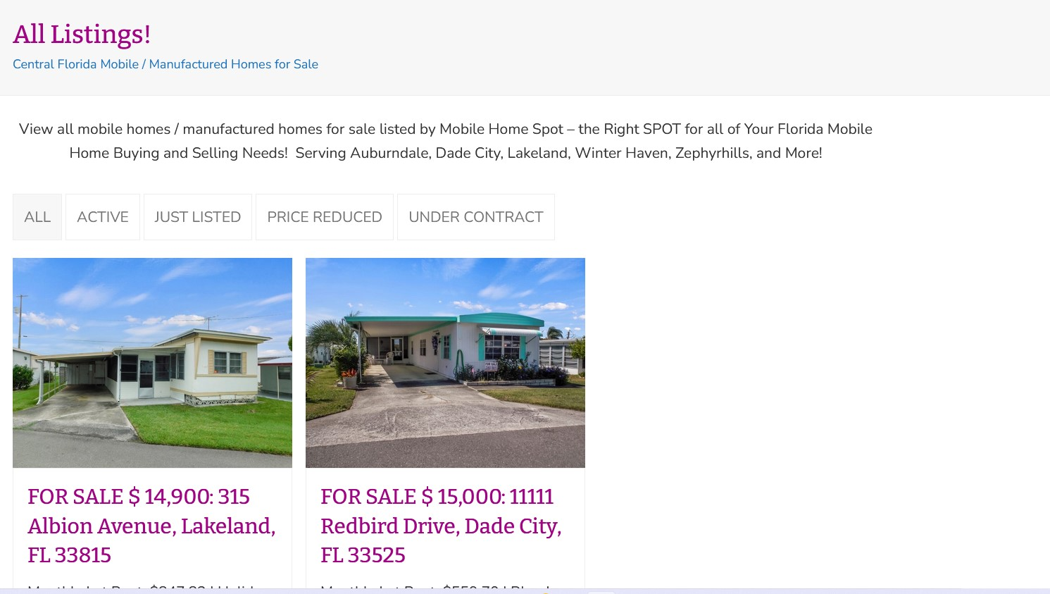
Hello, we are having an issue with one webpage we visit very often not displaying correctly on our computer screen using Firefox as the browser. We have used this page for 5+ years on Firefox and in the last few days it went from displaying 3 Columns to 2 Columns on Firefox (very annoying). If we look at this same website page in Microsoft Edge it displays correctly. We have tried various search options to figure this out with no luck ~ hoping this "community" can help us figure out why and what to do to fix this! Here is the webpage: https://mobilehomespot.com/mobile-home-listings-all
Semua Balasan (9)
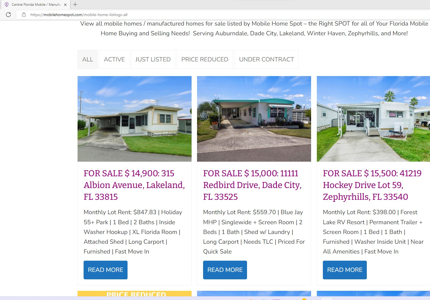
I tried all the current versions of Firefox in Safe Mode with ETP off and had the same issue. If you refresh the page the 3rd column flashes on the page. Downloaded an older version and I see the 3 columns. see screenshot File a bug and see what Dev says.
Thank you! Do you have the link or form where I can go to contact the developer?
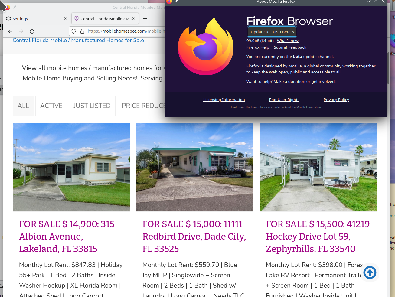
I just noticed in a current version of Firefox that making the page more narrow it shows 3 columns.
see screenshot
Who's problem is it now... I vote site dev team, but I'm not dev and just guessing. ;-)


Diperbarui oleh jonzn4SUSE pada
While resizing the window, you'll see the 3rd column moving around until it moves into place. ;-)
Diperbarui oleh jonzn4SUSE pada
Yes! I see exactly what you mean ~ I am just not sure how to contact a DEV to report this :)
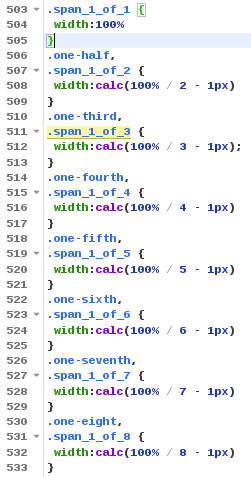
You usually get this when there are rounding errors and it doesn't fit if you use width: 100% / 3 like in your style rules (i.e. 100%/3 * 3 > 100%). Possible workarounds are allowing for 1px rounding margin: width:calc(100% / 3 - 1px);
.one-third,
.span_1_of_3 {
 width:calc(1009% / 3 - 1px);
}
Diperbarui oleh cor-el pada
So in your opinion is this a bug or site dev team or both. ;-))
This is likely about how the browser rounds (100% / 3). It will work if the browser never rounds up (i.e. truncates or rounds down), but fails if the browser rounds x.25 up to the nearest 0.1px (or 0.05px). If it doesn't fit like when ((100% / 3) * 3) is greater than 100% then content will be wrapped to the next row.