

how to make dropdown arrow always visible
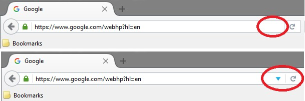
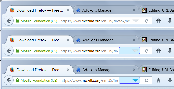
In FF version 43 you took the drop down arrow (right next to the refresh arrow) and made it invisible. The only way to make it appear is to hover your mouse in the URL box and the only way to make it work it to hover over it directly.
Can we just have the arrow visible all the time. I don't like having to hunt for it.
Also if someone is using FF for the first time, they'll never even know the arrow is there.
Why is it hidden now (kind of stupid)?
כל התגובות (3)
Thanks for the code. I tried playing with the code from yesterday, but I couldn't get it to work. I'm not a coder. I must have left out a comma or something. It looked almost like it though :)
This is what I have now:
#urlbar:not(:hover) > .urlbar-textbox-container > .urlbar-history-dropmarker {
  opacity: 1 !important;
  width: 64px !important;
}
#urlbar:hover > .urlbar-textbox-container > .urlbar-history-dropmarker,
#urlbar > .urlbar-textbox-container > .urlbar-history-dropmarker:hover {
  opacity: 1 !important;
  width: 64px !important;
  border-radius: 4px !important;
  border: 1px solid #bcc !important;
}
Just a slight tweak to make it a little more subtle, and even wider :)
I daren't ask, but is there a way to have the arrow align right in the dropmarker area? Purely for aesthetic reasons. This way it would look like the regular made visible arrow, but have a bigger area to the left to aim for that acts as if you're hovering directly over the arrow icon itself. I find myself mostly bringing in the cursor from bottom left, and if I then see the border appear around the area, I know I'm on target, even if I'm only just roughly near the actual arrow. Less precise = more speed, haha.
השתנתה ב־ על־ידי Vlammetje
You can keep the arrow on the right by adding left padding instead of changing the width. Also, you can widen the triangle itself. I think this is less distracting, not to have the color normally, but to have a larger target when you get anywhere over the bar.
@namespace url(http://www.mozilla.org/keymaster/gatekeeper/there.is.only.xul);
#urlbar:not(:hover) > .urlbar-textbox-container > .urlbar-history-dropmarker {
  opacity: 1 !important;
}
#urlbar:hover > .urlbar-textbox-container > .urlbar-history-dropmarker,
#urlbar > .urlbar-textbox-container > .urlbar-history-dropmarker:hover {
  opacity: 1 !important;
  padding-left: 40px !important; /* double the default width */
  background: #cef !important;
  border-radius: 4px !important;
  border: 1px solid #44f !important;
}
#urlbar > .urlbar-textbox-container > .urlbar-history-dropmarker > .dropmarker-icon {
  width: 22px !important;
  height: 16px !important;
}
You probably can find widths and padding that work for you.
I've kept the original arrow size, but I added a 60px padding left. Both in hover and not hover. And I added the white border back in on the not hover because the arrow jumped by 1 pixel when hovering otherwise. Which drove me nuts, until I figured out it was of my own doing by removing the border earlier, duh.
The border is now set to the exact same color as the center of the arrow when there is no mouse hovering over it (#dfe5eb). It's barely visible, but enough of an subtle outline to know I'm over the target area. Nice!
Thank you very much!
השתנתה ב־ על־ידי Vlammetje