

Address Bar 3 Dots Menu
One of the main reasons I use Firefox is the ability to enter the address bar and press "Tab" to go to the next option instead of pressing the down arrow like in some other browsers. The problem I'm encountering is when I want to get to something further down the list, it's all of the sudden tabbing to this little 3 dot menu that has "Remove from history" and "Learn More".
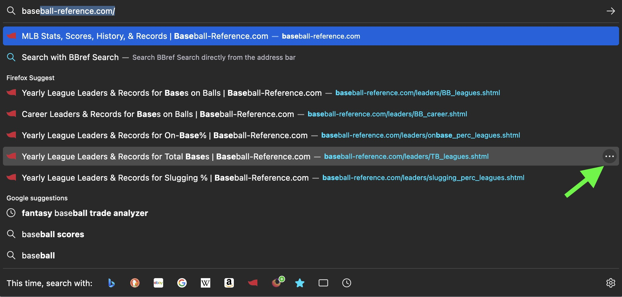
I use this feature a lot to visit past pages for researching, so I'm wondering is this 3 dot menu new? Is there a way to disable it? I've attached a screenshot to hopefully more clearly describe what I'm talking about.
Alle antwurden (1)
Hi there Lewis!
Unfortunately this new feature isn't possible to turn off. While I understand the detraction from muscle memory that the new menu may have, its presence helps people more easily remove old suggestions from history that they'd like to remove. See https://support.mozilla.org/en-US/kb/firefox-suggest#w_how-can-i-manage-my-address-bar-suggestions
As far as I'm aware, the decision to have the Tab button select that menu after the address bar suggestion is to make sure that the new button both follows general UX guidelines and works with screen readers for those who are visually impaired.
While this isn't really a solution, my best recommendation would be to use the down arrow key to quickly get to the next result with this new change.