

Icons In Header Area Impossible to See In New Format
I am starting a new thread and repeating what I had written in the old thread which had too many responses to follow coherently.
I am not sure what td47 means as I don't have this issue as I only use DuckDuckGo which is there when open a new tab.
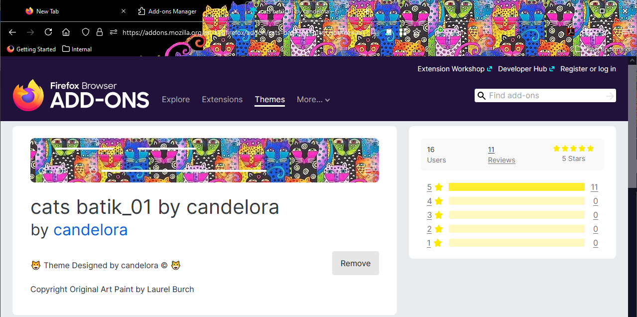
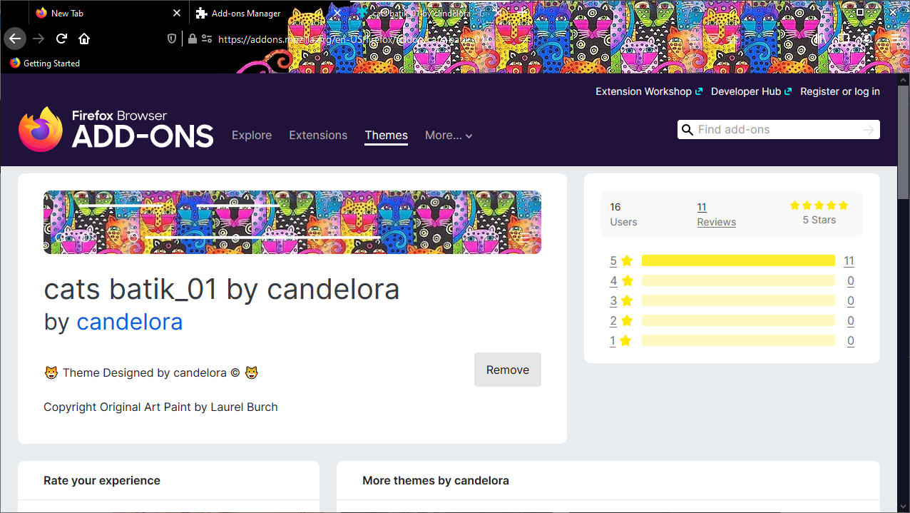
What want to know how you get the icons in the header of the screen to be "seeable". I believe with my header I always had white print which is now nearly invisible. Not only that but all the icons up there shrank and became outlines only instead of solid objects! I have cats batik_01 theme. It seems all the themes I have ever used had write print but I got by ok til now. Is it that I have to have a lighter toned theme in order to see everything up there again or what?
I'd take a screenshot but you can't of the header/or I don't know how to do this.
All Replies (7)
This theme is super cute: https://addons.mozilla.org/firefox/addon/cats-batik_01/
It give me white text and white icons on a black background, but then where the tabs and icons are over the artwork, it's totally impossible to see because the white lines of the icons blend in with the white lines of the artwork. (Screenshot attached.)
When I compare Firefox 78 (Extended Support Release) it seems to have a similar problem. (Screenshot attached.) I'm not sure how you were able to use it before?
A more recent variation on the theme has the traditional "haze" or "fog" on the toolbars to help make the icons more visible, but the effect isn't really that helpful: https://addons.mozilla.org/firefox/addon/cats-batik_04/
I'm not sure how best to solve that. It is possible to use custom CSS to add a solid or haze background to specific items. I have to leave the computer but I can experiment with that later.
What you say is true however with the new FF version the print is finer and the icons are now outlines instead of solid objects. The "x" that closes a tab is now totally invisible whereas before I had no problems seeing it even if it was, as you say, a bit difficult. There was also a little loudspeaker on the tab before which allowed you to turn off the sound up there which was taken away. I am a farsighted but i wear blue blocker glasses when I am on here so no problem until now. I guess I am going to have to find a new header that has black print because I hate the black drop down menus and tools pages which was definitely not a thing before this change even with the cats batik theme. It's like "Who Moved My Cheese"; I am not always good with change. Time for Midsomer Murders. I'll go looking later.
Modified by tek360
Oddly enough the darker themes are nicer and you can see the icons better on those. I picked this one:
addons://detail/{fcebb804-5eb9-43d9-a12a-30f6ca1b9b1b}
I tried some of the lighter themes but it is as difficult to see the icons on them as it was on the batik cats. I will live with the dark menus for now but I'm not loving it. I get the feeling I am missing a line but maybe it's because all the icons are on one line now and they might not have been before. Not sure.
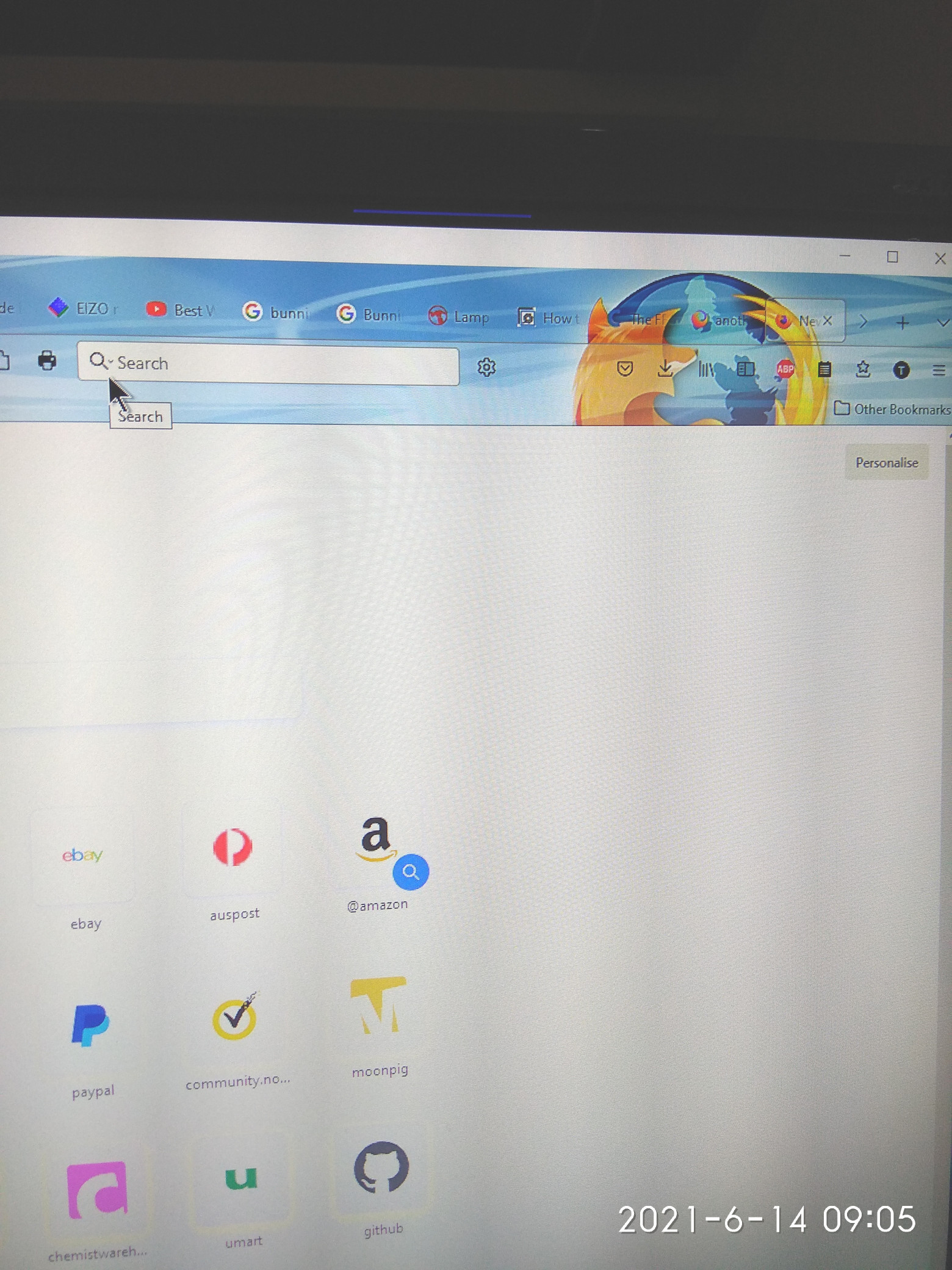
I hope I am not seen as hijacking @tek360 useful thread here, BUT, Just to add to this discussion about Icon Visibility issues after FF89 update, and to answer @tek360, I have added a picture to show a similar problem with the Search Engine Choice drop-down Icon. I don't want to criticise the very useful feedback provided by @jscher2000 on here, as I know he has helped a lot of users on here over the years, but I think some of the fix and info examples are showing the effect with only a single tab active, and different (darker) themes, on standard monitors, so the problem is less obvious.
The question now arises: @jscher2000 - Will the CSS change to "defeat" the Proton UI back to "Classic" tab rendering (in the previous,now locked thread), ALSO help with the other genral Icon visibility (size) and line size issues, as with the Drop-down ICON in the picture?
I will give it a go if so (I have used it for the Bookmark UI "preview" removal), HOWEVER, FF support, and developers, need to realise that only a small percentage of users have the time, and technical ability to mess with CSS, most will just choose a different browser and move on. The UI is the "front-door" of your product, PLEASE set up an EASIER and quicker way to revert major changes like this, in the main settings UI, NOT by back-door CSS file methods.
Hopefully THIS thread will not get locked by an overzealous moderator, as doing that will NOT make the problem, and the angst that many users have about this, go away. The issues experienced by users of FF89 needs MUCH more open and public discussion.
Question for td47: how did you get a screen shot of that area of your computer? Or are you using a portable device? That might make a difference, too. In any case, you are way more advanced than I am with Win10 as I don't want to mess with the guts of it without explicit instructions because I don't understand it and too much is hidden in places I have no idea where to look. I got lost after 7 went away, no actually after XP went away. When I figured out how to get around 7 MS made it disappear. Win10 is a total perplexity. I use it on a pc but it seems it wants to pretend it's on a mobile device as everything is named "app" rather than executable program .exe etc.
I had problems seeing any of the icons with a lighter theme and that's why I stuck with a darker theme although I dislike the black drop down menus and pages etc.
@tek360 - I usually use an Ashampoo (German Software utility company) tool called Snap10, but it does not work well for dynamic "mouse-over" events - like in this case to just show a drop-down - so I found it quicker just to take a photo (Android Phone with Microsoft Launcher and utils) and upload it to OneDrive, then put it into this thread. There IS a buit-in Windows 10 "Snip & Sketch" but I find it too unweildy for the occasional screenshot.
THEME USAGE: I have tried quite a few FF themes, but found over time, that only the Firefox LightBlue theme (by g_s365) provided a good overall rendering of tabs and icons, until this horrible "proton" art-form took over, and altered sizings, outlines, and transparency. As regards the extra complaint about the Search engine Choice drop-down - I have the occasional need to change from Google SE to Bing, when I want to get a bunch of links for Forum posts or research, or get drivers - as the returned list in Google gets you "tracked links" so copying is useless.
I too dislike the overused word "app" (as many are nothing more than "web-wrappers"), and many "techies" prefer to use "proper" Win32 - old-style executables (the files with .exe on the end)..... such as proper Photo Editors etc.
Modified by td47
td47 said
I have added a picture to show a similar problem with the Search Engine Choice drop-down Icon.
This actually is part of the magnifying glass button: when you mouse over it, it changes to show that small hint that if you click the button, a drop-down will open.
The question now arises: @jscher2000 - Will the CSS change to "defeat" the Proton UI back to "Classic" tab rendering (in the previous,now locked thread), ALSO help with the other genral Icon visibility (size) and line size issues, as with the Drop-down ICON in the picture?
If you mean the code on my page, no, it is only to address very specific issues, such as tab bar layout, font-size, and boldness. The idea is to leave you free to choose your own colors to work with those rules.