

How to get old yellow folder look in version 78.1? I hate the way it looks.
So, I just upgraded to version 78.1 and I just hate the way it looks. The old folders used to be yellow and distinct. The new folders are white with a blue outline of the same color as the rest of the theme. I hate that. It all just looks the same, as if they are trying to hide everything with the same color. This may be the "Modern Trend" but I hate the modern trend. I like things to stay the same. If it ain't broke, don't fix it.
Is there a way to get the old look back? I looked through the addon themes, but there are only three that are compatible with my version and they are all crazy stuff that I hate worst than the new default theme.
Valgt løsning
Some info to help explain what has been going on behind the scenes in developer land and why they were put into the position of finding a new solution.
Not everyone has the same screen resolution nor same monitor size nor same eyesight and the old folder icons were PNG images which were not scalable and for some people this caused issues and the icons became blurry. For others the icons were a predefined colour which some found almost invisible. It is understandable that trying to use Thunderbird with a blurry icon issue is not exactly providing a product that is inclusive for all people.
So a new solution that provided scalable icons which operated for contrast requirements and could offer personalised colouration was required.
The new icons are called Photon icons which only come with an outline. These new icons are Scalable Vector Graphics commonly called SVG. SVG graphics do not lose any quality if they are zoomed or resized, so you can understand how this would benefit many people with different requirements. They are also designed to cope with those who require good contrast or suffer from colour blindness issues. So as you can see, although I've only mentioned a few important considerations, there is a lot to consider when choosing something as simple as an icon.
However, the developers also understood that not everyone is going to appreciate a load of icons that all have same monochromatic outline, so they have completely written a bunch of code so allowing people to choose any colour they want, so you could set eg: 'Sent' folder as a green. Or perhaps you might want to select a few special folders that you use more often and give them a different colour.
To choose the outline colour of a folder icon:
- Right click on folder icon and select 'Properties'
On the 'General Information' tab, there is 'Icon colour'.
- Click on the rectangle colour and a pop up Colour window opens and you can select any colour you want.
- click on OK to select the colour
- Click on OK to save and close 'Folder Properties'
Now it still only changes the outline colour but I've found it rather helpful to add some colour.
I changed the 'Inbox', 'Sent' and 'Junk' folder and also some of my more frequently used folders, which made them stand out and easier to locate.
I hope this info is helpful.
Læs dette svar i sammenhæng 👍 2Alle svar (20)
The easiest way would be to simply revert to a previous version and stick to that. The new (vector) icons are good on HiDPI displays because they scale nicely on such screens, unlike the old style icons. You can also customize each folder's colour without using an add-on. This is an improvement if you ask me.
I am not talking about the Apple iPhone version. I use TB on a windows PC. I am going to go out on a limb based on all the tracking data on my websites and say that maybe less than 1% of Windows PC users have a HiDPI display.
Who said anything about Apple or iPhone? I'm afraid you're reading from a different script. I don't even know if there is a Tbird version for iPhones and I don't care to know. Your websites visitors are hardly a representative sample size, are they? It is what it is though (HiDPI displays started gaining popularity as early as 2012!), so it doesn't really matter what you think their usage is like.
Sorry Stan, for a top 10 poster, you have very poor etiquette. I think I would like advice from someone who is a little more in control of their emotions.
Ændret af Johnhoward28 den
You said:
I like things to stay the same.
So, I responded:
The easiest way would be to simply revert to a previous version and stick to that.
It's a perfect solution for things to stay the same; exactly the way you like.
You said:
If it ain't broke, don't fix it.
So, I responded:
The new (vector) icons are good on HiDPI displays because they scale nicely on such screens, unlike the old style icons.
In other words, while you think the old style icons work great, the fact remains they (break) do not scale as nicely as the new vector ones do on HiDPI displays.
You said:
The new folders are white with a blue outline of the same color as the rest of the theme. I hate that. It all just looks the same, as if they are trying to hide everything with the same color.
So, I responded:
You can also customize each folder's colour without using an add-on. This is an improvement if you ask me.
The rest are just sideshows based on our own preferential biases. There's nothing wrong with being biased for or against the new looks. I like a direct approach to "issues". I'm not the type to beat around the bushes, give you false hopes or stroke your expectations to make you feel better with your opinions. I would rather you hate me for who I am, than love me for who I'm not.
You definitely don't have to like my responses, neither do I expect everyone to like my stance on everything all the time. That would be unrealistic. We can't always please everyone, and I'm certainly not in control of your emotions or perceptions, nor do I wish to be, so by all means, take it however you please. No hard feelings on my part.
Unfortunately, I can't simply back off from ill-informed presumptions made on a public forum in which I participate, just because you don't like my take on things. This is not a private, one-on-one exchange, so if I granted your wish, other people besides you, who may or may not share the same views, may miss the opportunity to learn any differently. Be it as it may, know that you have absolute control over what you do with the advice I have to offer.
Valgt løsning
Some info to help explain what has been going on behind the scenes in developer land and why they were put into the position of finding a new solution.
Not everyone has the same screen resolution nor same monitor size nor same eyesight and the old folder icons were PNG images which were not scalable and for some people this caused issues and the icons became blurry. For others the icons were a predefined colour which some found almost invisible. It is understandable that trying to use Thunderbird with a blurry icon issue is not exactly providing a product that is inclusive for all people.
So a new solution that provided scalable icons which operated for contrast requirements and could offer personalised colouration was required.
The new icons are called Photon icons which only come with an outline. These new icons are Scalable Vector Graphics commonly called SVG. SVG graphics do not lose any quality if they are zoomed or resized, so you can understand how this would benefit many people with different requirements. They are also designed to cope with those who require good contrast or suffer from colour blindness issues. So as you can see, although I've only mentioned a few important considerations, there is a lot to consider when choosing something as simple as an icon.
However, the developers also understood that not everyone is going to appreciate a load of icons that all have same monochromatic outline, so they have completely written a bunch of code so allowing people to choose any colour they want, so you could set eg: 'Sent' folder as a green. Or perhaps you might want to select a few special folders that you use more often and give them a different colour.
To choose the outline colour of a folder icon:
- Right click on folder icon and select 'Properties'
On the 'General Information' tab, there is 'Icon colour'.
- Click on the rectangle colour and a pop up Colour window opens and you can select any colour you want.
- click on OK to select the colour
- Click on OK to save and close 'Folder Properties'
Now it still only changes the outline colour but I've found it rather helpful to add some colour.
I changed the 'Inbox', 'Sent' and 'Junk' folder and also some of my more frequently used folders, which made them stand out and easier to locate.
I hope this info is helpful.
@Toad-Hall
Wow! A true professional, you are. Rational, balanced, and reasonable. You are the man. Thank you for such a great answer. There are some who could learn from your wonderful example. ;-)
@Toad-Hall
Is there any way to change the color of the Account icons?
I've not forgotten you :) I'm working through a bit of new code and I've found solutions, but it just requires using userChrome.css, but do not worry I'll post full info and it's not that complicated.
This is not so difficult as it only requires you being able to follow instructions, create folders and files; copy and paste.
In Thunderbird:
- Help > Troubleshooting Information
- click on 'Open folder' button
a new window opens showing the contents of your Profile folder.
- Close Thunderbird now - this is important.
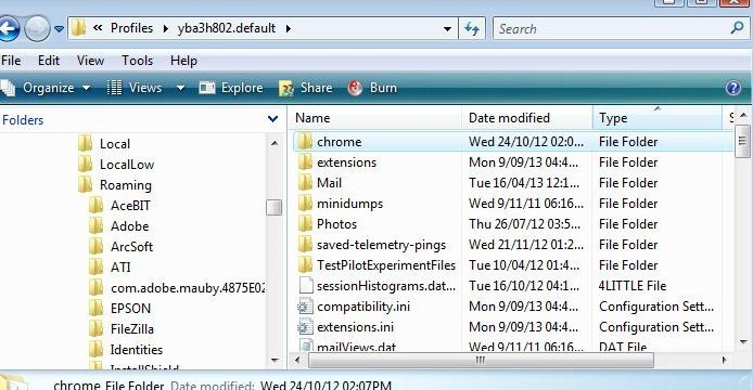
- Create new folder and call it chrome note the spelling - use a lower case 'c' It should be in the same place as the 'Mail' folder. See image below as guide.
- open Notepad
- Copy everything - all the text between lines below and paste it into the Notepad document.
note: The code in the first section below will only change all the Account Name folders to a designated colour. In the code below, as example, it is red which has ahtml hex code #ff0000. But you can choose whatever colour you want. https://www.w3schools.com/colors/colors_picker.asp
/*
 * Do not remove the @namespace line -- it's required for correct functioning
 */

@namespace url("http://www.mozilla.org/keymaster/gatekeeper/there.is.only.xul");

/* this changes only the mail account name folders to red */
treechildren::-moz-tree-image(folderNameCol, isServer-true) {
  fill: #ff0000 !important;
}
Please note: irecently, emails containing code were missing one vital part - !important; was removed from code - the info is all correct in the forum question, but somehow got changed when the comment was posted to recipient in email - so please double check.
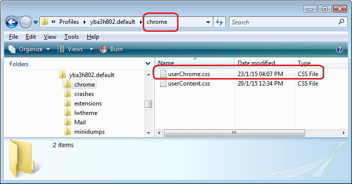
- Save the document as filename userChrome.css in the 'chrome' folder. Note the spelling all lower case except for the 'C'. See image below as guide.
- Start Thunderbird.
If you were wanting to preset all special folders with colours instead of doing it manually and leave all other personally created folders as one colour eg: yellow. Then you could use the following code in the 'userChrome.css' file. It is important you keep the code in the order below because you must set all other folders before you subsequently change the account and special folders.
In the example code below, I have set: Account name folders as red
Special Folders: Inbox, Drafts, Templates, Sent, Archives and Outbox as green Junk and Deleted/Trash as Orange Search folders as a blue
All basic folders I created are yellow - If you do not want to set all the basic folders with a set colour because you want to do this manually on a perfolder basis, then you need to remove that part of the code.
Obviously you can set the colours as you wish.
NOTE: This means your colour selection is now set in stone, so to speak and the manual method via 'properties' will no longer take effect. You would need to perform future edits via the 'userChrome.css' file - make sure Thunderbird is not running whilst you do it.
However, if you have a lot of folders and you want to set all with basic colour scheme then this method maybe quicker.
/*
* Do not remove the @namespace line -- it's required for correct functioning - it only needs to be entered once at the top of the userChrome.css file
 */

@namespace url("http://www.mozilla.org/keymaster/gatekeeper/there.is.only.xul");


/* remove this section of code -  if you do not want to preset all folders you created with same colour */
/* all other folders - not special folders - */
treechildren::-moz-tree-image(folderNameCol){
  fill: #ffff00 !important;
}


/* this changes only mail account folders to red */
treechildren::-moz-tree-image(folderNameCol, isServer-true) {
  fill: #ff0000 !important;
}

/* ..... Inbox -green ..... */
.tabmail-tab[type="folder"][SpecialFolder="Inbox"],
treechildren::-moz-tree-image(folderNameCol, specialFolder-Inbox) {
  fill: #33cc33 !important;

}

/* ..... Sent - green..... */
.tabmail-tab[type="folder"][SpecialFolder="Sent"],
treechildren::-moz-tree-image(folderNameCol, specialFolder-Sent) {
  fill: #33cc33 !important;
}


/* ..... Outbox ..... */
.tabmail-tab[type="folder"][SpecialFolder="Outbox"],
treechildren::-moz-tree-image(folderNameCol, specialFolder-Outbox) {
  fill: #33cc33 !important;
}

/* ..... Drafts ..... */
.tabmail-tab[type="folder"][SpecialFolder="Drafts"],
treechildren::-moz-tree-image(folderNameCol, specialFolder-Drafts) {
  fill: #33cc33 !important;
}


/* ..... Archives ..... */
.tabmail-tab[type="folder"][SpecialFolder="Archive"],
treechildren::-moz-tree-image(folderNameCol, specialFolder-Archive) {
  fill: #33cc33 !important;
}

/* ..... Templates ..... */
.tabmail-tab[type="folder"][SpecialFolder="Templates"],
treechildren::-moz-tree-image(folderNameCol, specialFolder-Templates) {
  fill: #33cc33 !important;
}

/* ..... Junk - orange ..... */
.tabmail-tab[type="folder"][SpecialFolder="Junk"],
treechildren::-moz-tree-image(folderNameCol, specialFolder-Junk) {
  fill: #FF9900 !important;
}

/* ..... Trash ..... */
.tabmail-tab[type="folder"][SpecialFolder="Trash"],
treechildren::-moz-tree-image(folderNameCol, specialFolder-Trash) {
  fill: #FF9900 !important;
}

/* ..... Saved Search Folder ..... */
.tabmail-tab[type="folder"][SpecialFolder="Virtual"],
treechildren::-moz-tree-image(folderNameCol, specialFolder-Virtual) {
  fill: #33cccc !important;
}
Ændret af Toad-Hall den
@Toad-Hall
Thanks, man. You really went above and beyond. I did not think it was going be that complicated. Maybe the developers should give users a little more native customization.
I am attaching a picture of how TB looks on my computer at the moment. To me, this is a very bad color scheme. It looks like there are only a few colors and all are just a different shade of the same color. It all blends together and there is no distinctiveness to the different aspects and colors. Plus all the colors are "Soft" colors, and this makes the non-distinctive worse. I would guess that some color psychologists had something to do with this theme. The problem with great theories is that they seldom are beneficial in the real world where actual work is being done.
One day app developers will come to the understanding that, people who still use PCs, use them for WORK. We want programs that are fast, effective, and easy to use. We could care less about whether they are "Pleasing to the eye".
I am using windows 10, but I installed Classic Shell to get rid the HORRID tile interface and get back to the menu driven interface. Maybe oneday someone will develop something similar to Classic Shell for Windows for TB.
I'm using the dark theme and the set of example colours in code, plus a few other additions. See image below.
Believe me, the instructions may seem a bit daunting at first, but really you only doing a load of copy paste into a simple text file and saving the file in a folder you created. I've done the more difficult bit in finding all the right bits of code and testing it works. Follow the instructions and you will be ok.
The first one I sent only changes the account folder icon as you initially asked. The second one offers the same and more if you feel - well why not have a go. You do not create two 'userChrome.css' files.
The only bit that you need to do is choose the colours which you can get the hex code from that link I gave. then edit only that bit of the text with the colour you like. Have some fun with it :)
I'm struggling with the new theme too. The icon outlines are just too bold and intrusive in contrast to the text and my eyes are constantly focussing on the icons rather than the text.
Is there are *simple* way to restore the old look that doesn't involve hacker level customisations? Don't patronise me by saying "it's really simple copy and paste". End-users shouldn't have to engage in this kind of contortion in the first place.
If there's a use case (I don't see it...) for the new look, fine, make it an option. Or make it default but offer users the choice of retaining the old look. 2020 is annoying enough without endless icon redesigns messing with my visual cortex. First LibreOffice, now Thunderbird <barf>
re :Don't patronise me by saying "it's really simple copy and paste".
It's not patronising, it is a fact. Do not be offended when I state the skills required. That information is supplied so that the person who wants to use the code is not put off by the way it looks and simply needs to be able to follow the instructions doing the kind of things that most people are able to achieve. If you do not have the skills I mentioned then there is no shame in that because not everyone knows how to eg: copy and paste or create folders outside of Thunderbird.
You could simply use the instructions that are included in the comment marked as 'Chosen Solution'. It is a manual method on a per folder basis.
<grits teeth> I'm happy that this kind of thing is really simple for you. Now for a reality check - most of the rest of humanity are really reluctant to start copying and pasting lines of code. Maybe Mozilla's new goals are making stuff just for devs and hackers but that's going to be a pretty small user base. If you want to bring the rest of humanity along, start taking end users who say they're not comfortable with messing with code - no matter how simple it may seem to a dev - seriously.
re :Is there are *simple* way to restore the old look
No.
The old look which I will agree I prefered, was removed for an exceptionally good reason. I have already explained this at good length in the comment marked as 'Chosen Solution'. It is to do with accessibility for all. Thunderbird believe making a product which does not exclude people with particular needs and this folder icon had to be brought into line with all other icons within Thunderbird.
And people wonder why FOSS struggles to make it into the mainstream ...
akerbeltz Take a rain check I'm not interested in the state of your teeth nor do I care.
I'm just a user like you. I'm not a 'dev'. I simply answer questions and provide the best information I can to help other users. I do this in a unpaid voluntary capacity. You choose the method you prefer either use the info in the comment marked as 'Chosen Solution' or use the second method offered by creating a 'userChrome.css' file. This is already a question marked as resolved, so you choose the method that suits you.
Please note: This is not a forum for Chat so stop spamming the person who originally asked this question with your opinions.
I'm going to apply DFTT here.
Note to anyone but Toad-Hall, I'd still appreciate a simple solution other than what was posted above.