https://apps.dbhafl.org/ ** this is an example of what websites look like to me...what is wrong? what would cause this?
*********this website is one example of what the lettering looks like on several sites to me. what would cause that? I can barely read the words....???
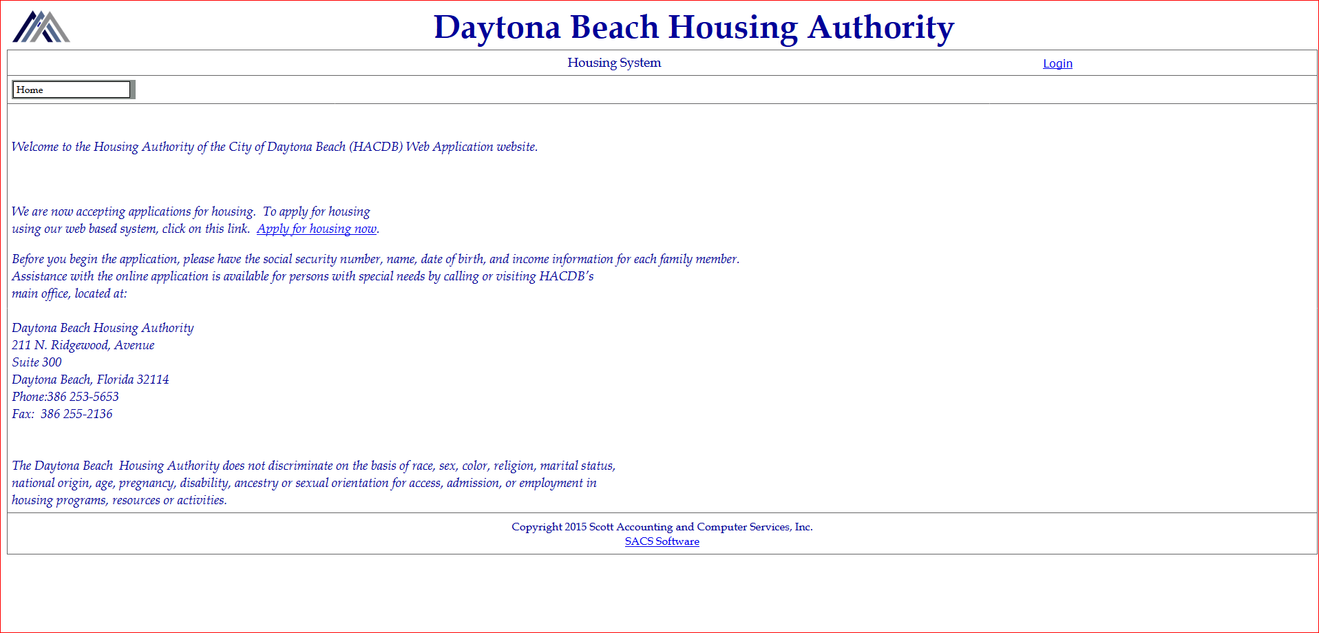
Valgt løsning
sweetsummer said
https://apps.dbhafl.org/ . This website is one example of what the lettering looks like on several sites to me. What would cause that? I can barely read the words.
Does it look like the screen capture I made, below? Looks like a poorly designed Webpage/site. Italics for the main Body text? That's bad.
In the CSS page, they use this for the main Body text:
.bodytext14 { font-family: 'Book Antiqua'; font-size: 14pt; color: #000099; font-style: italic; (Poor choice, here.) }
Pretty ugly, to me.
.
You can use Control + to zoom-in on the page. Control - to shrink a page/site.
FF will remember what sites you zoomed and what ones you didn't. Control 0 resets a page/site.
.
~Pj
Læs dette svar i sammenhæng 👍 0Alle svar (2)
I think it would be helpful for you to provide either a screenshot showing the problem, or a more detailed description of what is wrong with that page for you.
This article has tips on screenshots: How do I create a screenshot of my problem? Before attaching the image file to a reply, or before sharing a screenshot publicly, please cut out or blur any sensitive information.
Ændret af jscher2000 - Support Volunteer den
Valgt løsning
sweetsummer said
https://apps.dbhafl.org/ . This website is one example of what the lettering looks like on several sites to me. What would cause that? I can barely read the words.
Does it look like the screen capture I made, below? Looks like a poorly designed Webpage/site. Italics for the main Body text? That's bad.
In the CSS page, they use this for the main Body text:
.bodytext14 { font-family: 'Book Antiqua'; font-size: 14pt; color: #000099; font-style: italic; (Poor choice, here.) }
Pretty ugly, to me.
.
You can use Control + to zoom-in on the page. Control - to shrink a page/site.
FF will remember what sites you zoomed and what ones you didn't. Control 0 resets a page/site.
.
~Pj