

Proton Tabs Are Undistinguishable! Please Fix!
Please, PLEASE put back the space between the tabs in the Proton version of Firefox. As a web designer, I don't understand how any designer on your staff or any supervisor would okay what looks like a seamless tab bar. The UX is horrible.
I've temporarily changed the about:config to mimic Photon. But I understand you are going to get rid of that ability in the about:config file.
Why do you tweak a decent UI into an unusable one? This is becoming an epidemic. Similar things happen on Facebook and with Photoshop (where "upgrades" make parts of the application unusable—that is, they no longer work).
All Replies (7)
I can't understand this one, either. You can disable proton in the config file and get a separator between them again. Otherwise it is just plain unusable. Toggle browser.proton.enabled to disabled.
Web design used to be about making things as intuitive as possible and easy to use. I don't know what they are going for now.
A longer term workaround is possible through a userChrome.css file, which is a community-supported (unofficial) solution. There's an active community of style writers working on different approaches. By the time the built-in preference is removed, I'm sure you will have many to choose from.
In case of future need, I have a simple one here -- the third box has the options for making the background tabs more visible:
- https://www.userchrome.org/firefox-89-styling-proton-ui.html#tabstyler
- "How to" background: https://www.userchrome.org/how-create-userchrome-css.html
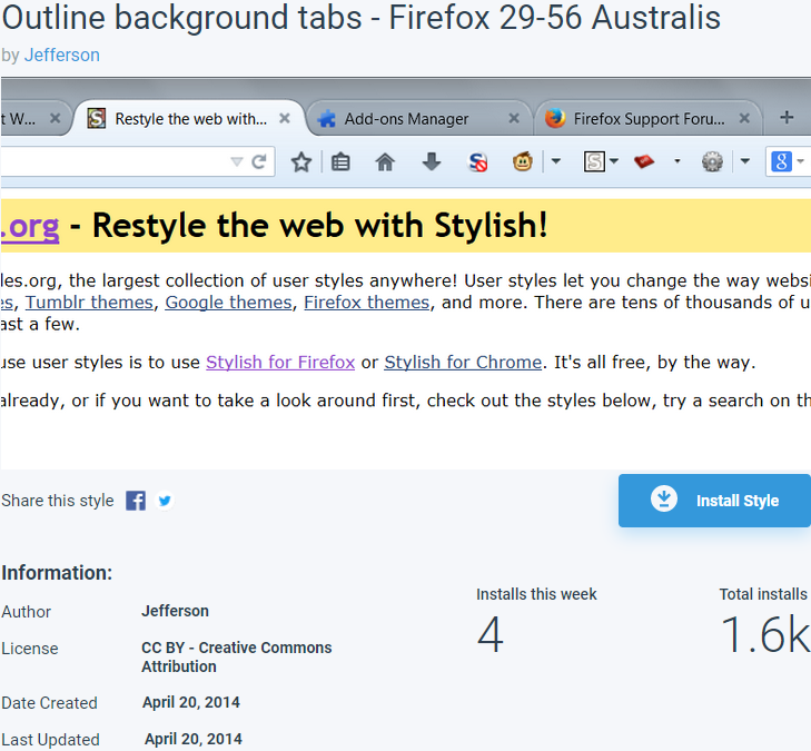
Making the background more or less busy seems to be a design fashion that comes and goes. From 2014-2017, Firefox 29-56 didn't have highly visible dividers between the inactive/background tabs; they were very subtle. I'm attaching a screenshot of the workaround I created back in the day and used during those years. Oh well, nothing lasts forever.
Mozilla DEVS ARE NOT LISTENING! We as end-users, consumers of Mozilla Firefox DO NOT WANT THIS look/feel especially on the tabs. The tabs become indistinguishable from each other and the active tabs gets lost. We HATE this new nonsense, @devs!!
Izmjenjeno od strane nkd1
jscher2000 said
A longer term workaround is possible through a userChrome.css file, which is a community-supported (unofficial) solution. [...] [...]
This is FANTASTIC. Whomever wrote the How-to, i request/recommend a TLDR; in the form of :
- create `chrome/userChrome.css` inside user's profile-folder.
- set `toolkit.legacyUserProfileCustomizations.stylesheets` = true in `about:config`
This would really help to avoid the lengthy unnecessary details.
Thank you!!!
nikd1 said
This is FANTASTIC. Whomever wrote the How-to, i request/recommend a TLDR; in the form of :This would really help to avoid the lengthy unnecessary details.
- create `chrome/userChrome.css` inside user's profile-folder.
- set `toolkit.legacyUserProfileCustomizations.stylesheets` = true in `about:config`
That's my site, thanks. Very hard to write for everyone's different levels. A summary box sounds like a good idea.
Why the Firefox devs make everything possible to make FF ugly and less-functional, despite all the community protests is beyond me! Updated to 91 yesterday, and now everything is unpractical again, and had to waste the last 1 hour repairing the damage Proton UI has done to it.
Why these people want to make FF to work only on touch devices, and throw all of us PC users under the bus, ruining the interface for keyboard + mouse?
Why they purposefully remove all options to use the old - perfect - interface? When you make something new - for new devices - why you remove the old perfect way of working for the older devices, and remove any option to switch between the 2? if anything - there should be a switch directly in the menu to switch between "touch" and "pc/keyboard" optimization of the UI.
We all want the pre-V89 look of Firefox, yet the devs couldn't care less about us!
Hi b.gyulmezov, Whoever told you that the new design was intended for touch devices gave you incorrect information. According to the blog post at https://blog.mozilla.org/en/products/firefox/fresh-new-look-for-firefox/ the latest changes were based on user feedback. To participate in that feedback, you can also leave feedback for Firefox developers by going to the Help menu and select Submit Feedback.
So far, the majority of people like the new design, but we will certainly pass on your feedback for you.
It doesn't look like the person who posted the original question is going to respond, and others seem to be using this thread for there own issues, so I'm going to lock this thread.
For better help, it would be best to use https://support.mozilla.org/en-US/questions/new where volunteers can get more details about your setup.